Final Major Project Evaluation


My name is Rachel Jacob and I am a student at Harlow College, I am currently studying Photography and apart of the Level 3 Extended Diploma Class. I started getting into photography whilst in year 9, it was the first year that photography was introduced as a new class at my secondary school, and this was my first opportunity to gaining any GCSE’s. I was always into the creative based subjects such as media and graphics so I decided to take photography on board and give it a go. I knew from the start that I wanted photography to be apart of my career and future, I left year 9 with my first photography GCSE resulting in an A grade. I am always looking for chances to take photos, even if it was just on my iPhone. Year 10 and 11 passed and it was time to think about college, I knew how much I enjoyed my year 9 photography class so decided to progress upon this and enrol to the Art and Design photography Level 3 course at Harlow College. Within photography my favourite interests are torn between landscape and portraiture, I knew at any given chance that I’d want to focus my work around these subjects. I now take photos with my Canon 1200d camera; the quality of the camera I feel improves my photos, especially when you learn how to adjust the camera settings. I have now completed my second year at college studying photography; I hope that I am able to attend University in September to study Media and Communications.

For our Final Major Project we were to produce a range of photographic formats that could be in any form that we wish to present in. We were allowed to freely pick what we photographed as long as we could back it up with a firm range of research, developmental shoots and final images. The photographic format that I decided to layout my work in was in the style of magazine cover and spread.

The main idea for my project was to have a contrast between the front cover of my magazine and inside spread to show the process of getting ready for the front cover. It will show the difference between the pre and post production of a shoot before the photos are heavily Photoshopped. Along with this I gathered together a variety of research using multiple methods such as primary, secondary and developmental.  I presented different form such as written, mood board/sketches and visual diaries and experiments.

As we had to start from scratch I completed my brief first which enabled me to think about the possible ideas for my shoot and what route I wanted to take. Within the brief I answered four different sections on Who Am I, What Do I Like, Secondary Research and Conclusion. This allowed me to think about myself and what I enjoy doing the most, it also made me think about how I could include any of my existing hobbies and interests into my final project. I reflected back on previous projects and spoke about what interested me the most and what I would like to try again in the future. Looking back at my brief now I can see how I have slightly changed my ideas and expanded on the amount of work I wanted to present in the exhibition. It shows I was able to develop and work around any problems that occurred to make my project better and more appealing to the audience.

The next thing to complete was my project proposal, which allows me to have a solid idea and plan the outcome I am hoping to have by the end of this Unit. I answered each section of the project proposal using the template questions, they covered most things that I had already mentioned in my brief, however I was able to expand on it and explain how I am going to incorporate different ideas and issues into one project. I had to make sure that my idea was going to be challenging, creative and something I felt strong about as it gave me multiple things to write about and expand my work through different aspects.

Once I had thought about the possible outcomes I was able to string together a final idea. For my final major project I decided to base it around the concept of body image and Photoshop is a massive influence within the media. As there is lot of different platforms of media, I focused mine around magazine covers and spreads; to include the use of Photoshop and what damage it has done in the past. I imagined my final piece to be three sets of a cover and inside spread; they resulted in a final set of six overall images to represent my FMP. The main idea was to show a major contrast between the front page photograph and inside spread photographs, I want to overly edit using different techniques and skills in Photoshop to make the model, in this case myself- body into something it isn’t, However, still making he body features look realistic. The inside spread pictures are not to be edited in the same way that the front cover image will be. These images will represent the pre production process of getting ready before the shoot. I wanted to feature the different aspects of a shoot and make them editorial styled. The front cover will then show the final outcome of what the inside spread is leading up to. Overall, I wanted to show the amount of work and effort that goes into pre production, production and post production all for a final few shots and what a drastic change it makes to model’s feature once they have been Photoshopped and what influence that has upon readers once they see it in magazines.

To back up my project plans I needed to carry out a variety of different research pieces, all in which was relevant and able to help me develop my idea. I researched a total of seven photographers as I felt it was enough to cover each aspect of my project. I took their either a speciality, technique or concept from each photographer that I felt I could use within my own work and did some in depth research online about them and their work. I analysed four images from each photographer, I talked about angles, lighting, concept, techniques and how I could do something similar. I researched the styles of photos I was willing to take and annotated a couple of them to get to grips with the things that stood out the most and what made the pictures unique. The first photographer I researched was Annie Leibovitz, she specialises in portrait photography- something that will definitely be featured in my project. I used her as one of my two concept photographers as she captures pictures for magazines; I looked into her magazine covers that she has done previously to get an idea for layout and what poses she made her models do. I have never modelled before so I needed to get a good idea on what to do for my own pictures. She has worked along side big names in today’s society and wanted to make sure I included this in my research piece. I was able to create an image-based solution based on her work, I took a photo of Kim Kardashian and inserted the Vogue logo to make it look like something she had taken. The second photographer I researched was Rankin; he focuses on portrait a fashion. I am using his technique of makeup in my project as I like the way he plays around with different colours on his model’s faces, he expresses a ray of emotion and reflects mood and dimension. His work has been features on a variety of campaigns and I feel I can incorporate his techniques within my own work. I created an image-based solution based on his work, I took a portrait photograph from google images and made sure the model had bright makeup on, in the case- yellow lipstick. I then thought of a brand that I knew sold a lipstick in a similar colour and added their logo next to it to make it into an advertisement in the style of Rankin. I am very pleased with the outcome of this piece. The third photographer I decided to Photoshop was Cindy Sherman, She is one of the main influences in my project as her concept is very important. Sherman did a project called Untitled Film Stills; within this project she put herself into the shoes of actors and actresses and made out she was in different films that go un-named. She would feature in her own photographs as well as plan and direct everything else. This meant that she would have taken her own photos using a self-timer. I love the concept she has used as she has shown the work that has gone into the pre and post production by using herself instead of bossing others around. It gave her a feel for what actors and actresses must feel like in that industry. Therefore I am going to use myself in my photos and put myself into he shoes of models and what they go through in a shoot process. I will be taking on each job in my project such as planning, directing, featuring and editing to show the many processes to go through before the final product is on the shelves in shops. She used props and different location to match the film still as accurately as possible. She produced a total of 83 film still using the same concept. I love that she wanted the audience to make up their own stories of what might be happening in each photograph. She said that she didn’t want them to look so “studio styled” – I will use this idea within my inside spread shoot. The fourth photographer that I researched was Carri Angel, I used her concept of fantasy styled imagery as once my photos are Photoshopped they turn into a fake, illusion fantasy. I analysed her work and how she incorporates and achieves fantasy into her photographs. The fifth photographer that I researched was Julia Kennedy, she focuses on capturing fashion and beauty- both things that I will include in my project. She does a lot of editorial work and I wanted to get inspiration from some of her pieces and I wanted to get a feel for the types of angles and shots I should take in my own shoots. I like the way her photographs are very laid back and usually on location but focusing very well on the clothes that the models wear. The clothes correspond to the location setting. I took into account the clothes that I dressed myself in and how they made the picture look different. I picked out a range of outfits to choose from when capturing my editorial shoots, which I will talk about later on. I referred back to Kennedy’s work when styling myself, as I didn’t want the clothes to be too distracting. The sixth photographer that I researched was Lord Snowdon; he is a British Photographer and filmmaker who captures portraits in the style of society and reportage. I used his technique of society photography in my project as I want to use it to capture my magazine shots, he takes quite laid back photographs which usually are focusing on the Royals’ jewels, the photos are there to capture memories. I created a magazine styled image based solution based on his work; I included a photograph of William, Kate and George as I imagine his work in a magazine like this. The seventh photographer that I researched was Mario Testino, he is a fashion and portrait photographer. I am using him to contrast the research I have done on Lord Snowdon, Snowdon captures society whereas Testino captures reportage. The two photographs allow me to see the difference between the two styles of photography. I am using Testino’s technique of reportage photography as I am doing that type of style within my magazine spread. Testino is familiar with capturing models for magazines, so I have created an image based solution based on his work that he has captured, I have made a magazine spread that I feel would tie in the best with his theme of work. Each photographer has helped fill an aspect of my project, allowing me to expand on my ideas and techniques in their style.

I did some extra research on Body Image, Magazine Spreads, Vogue and Photoshop influence to help back up my ideas and enable me to explain the different points within each tangent that will influence my project. In the body image post I spoke about how audience members are taken back a bit by the type of photos that are published in magazines and how there isn’t a variety of models featured as they are usually skinny, female and famous. There is a supposed way that females are meant to look and how perfect that somebody should be. The appearance of the body may not correspond to the standards of society. This ties in with my Photoshop influence post as I spoke about how Photoshop is using to depict the human body in order to make it look “better” to then be published in a magazine. It gives an illusion of a perfect body and has created damage in the past with different campaigns and advertisement companies. The influence Photoshop has on many shows what one simple image can do and can make an individual feel bad about their own body. I wanted to go through the Photoshop process within my own photos so I made sure I was able to heavily Photoshop my front cover page in order for it to contrast with my inside spread which was not edited. I researched Vogue as I am mimicking their front covers; I thought it would be right to get a feel for their background history before putting their logo on my work.

Alongside my research I made sure that I kept track of the websites I was taking information off of by making a Bibliography post. Here I copied an departed each link I referred from to get my information.

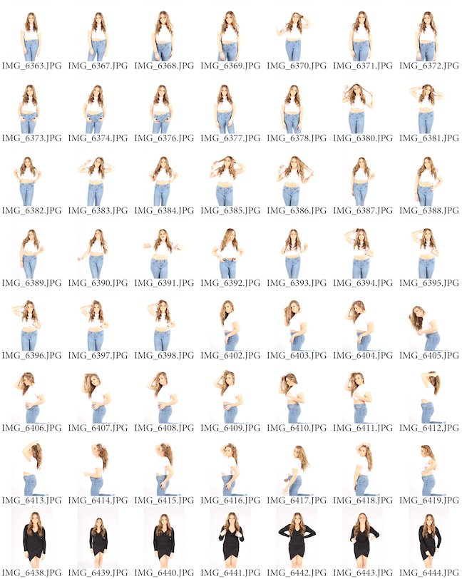
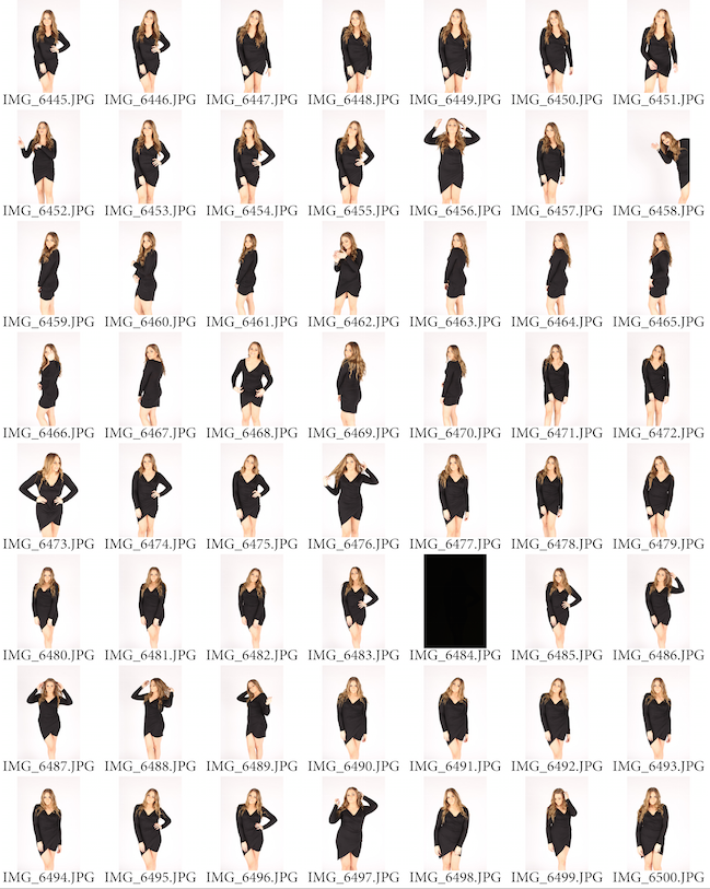
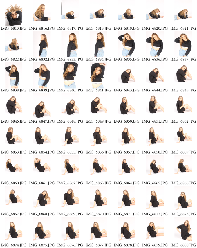
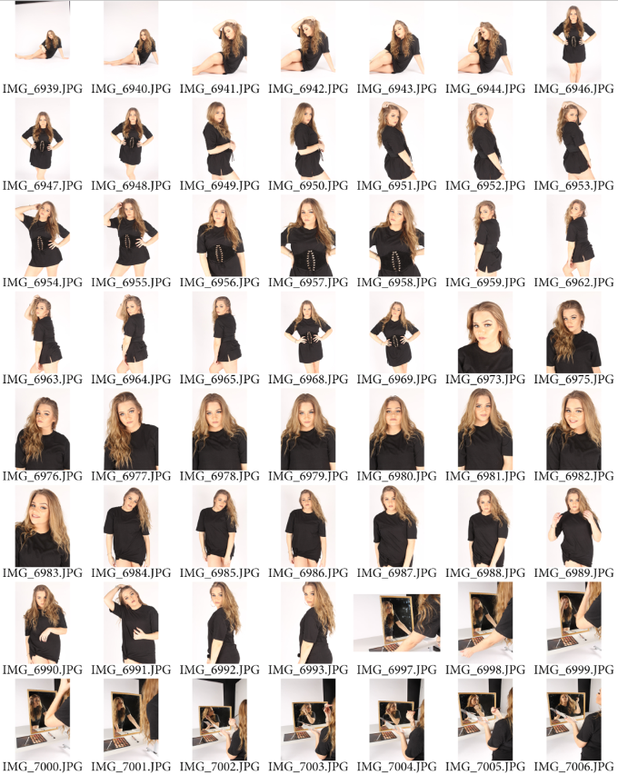
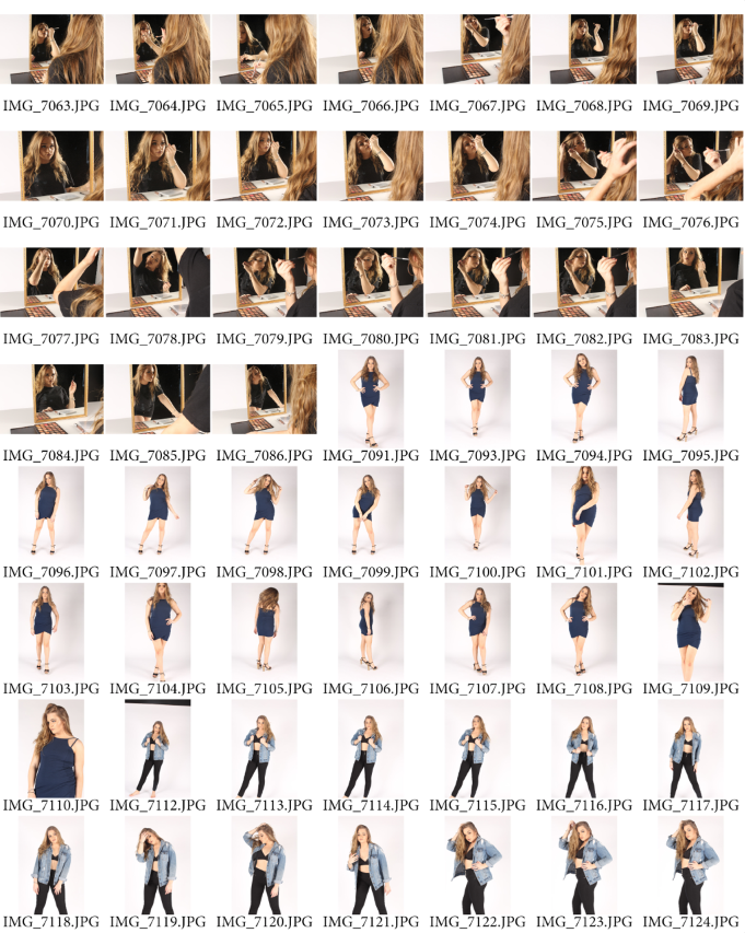
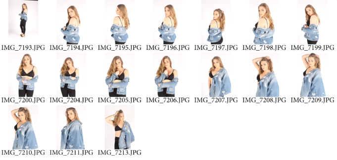
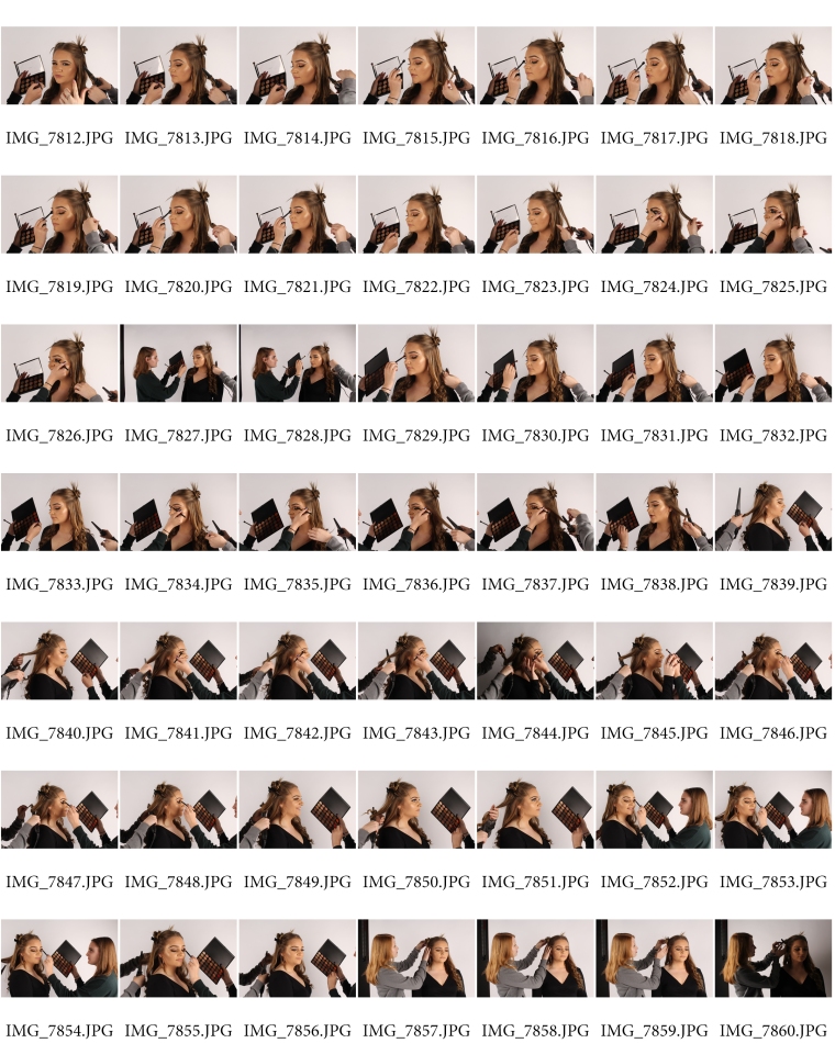
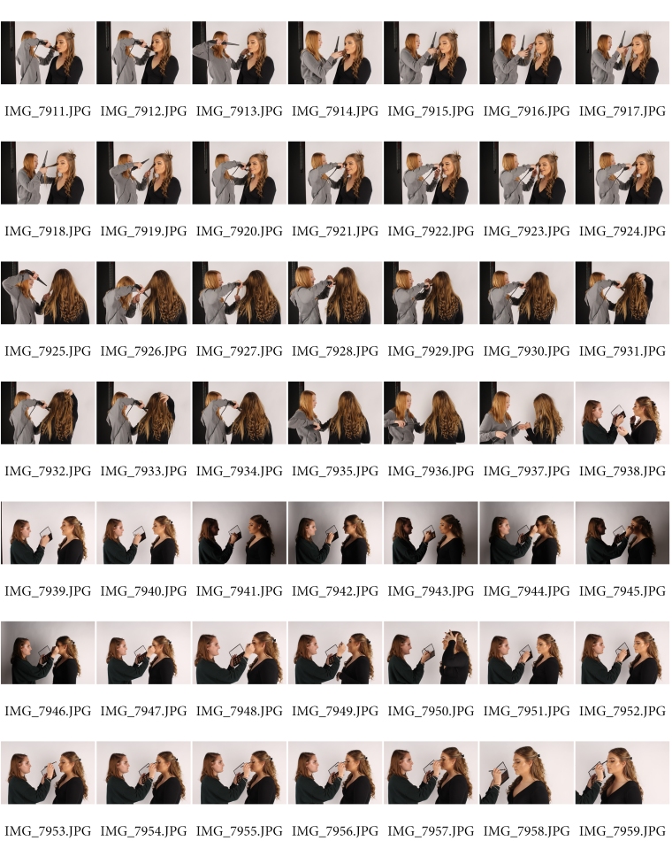
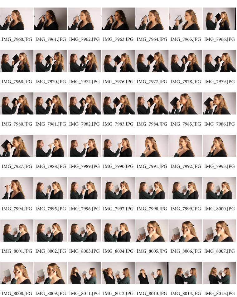
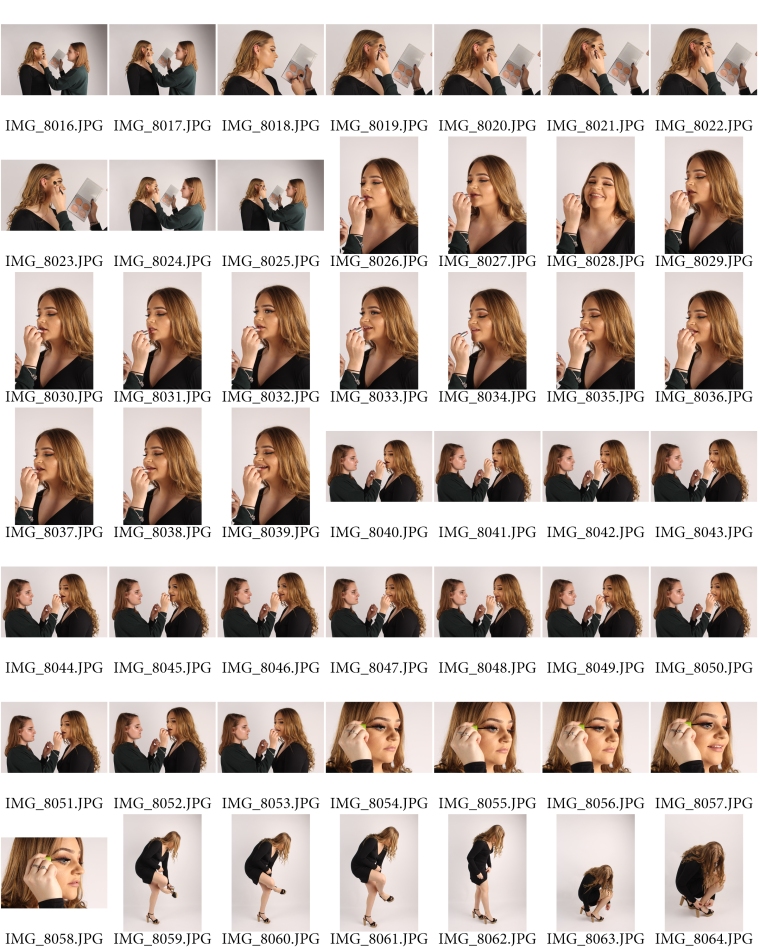
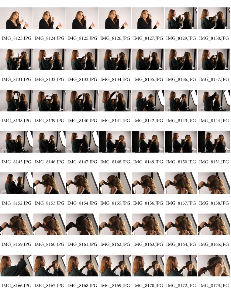
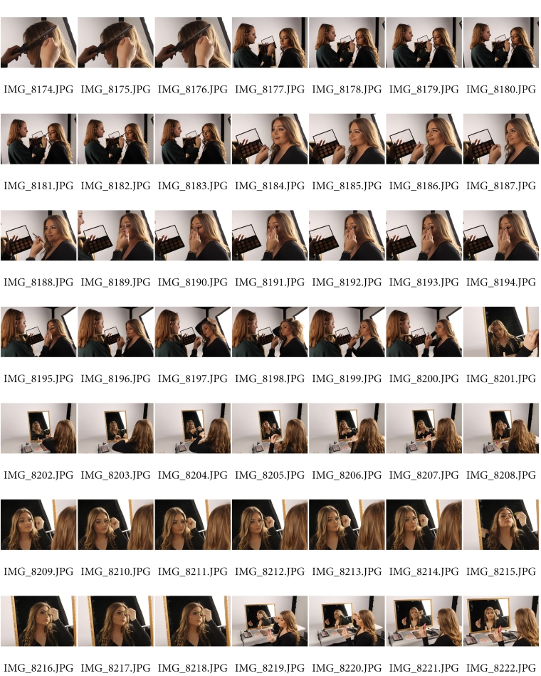
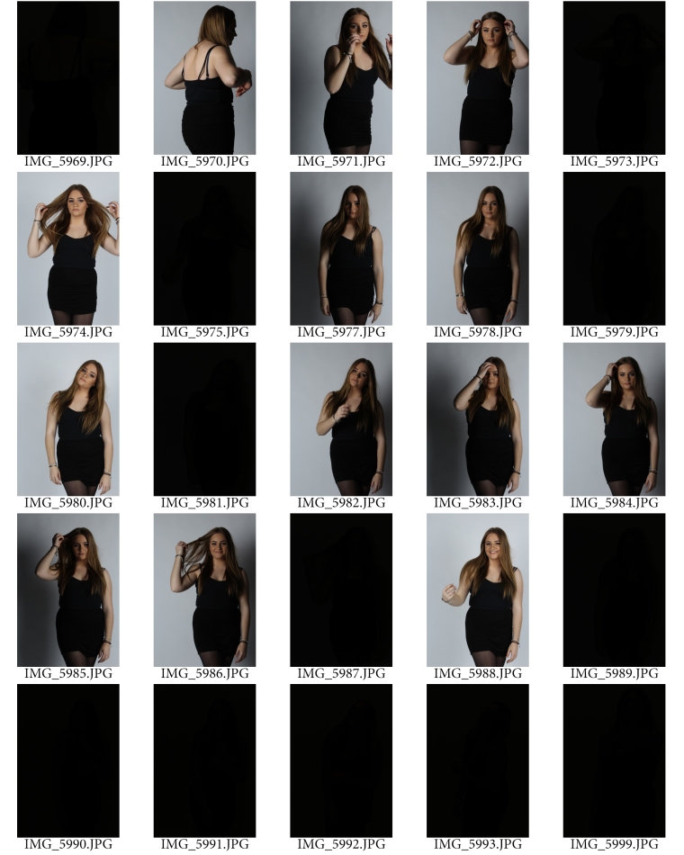
The next step I had to take in order to develop my project ideas was to carry out multiple experimental shoots in the studio and on location. I started off with a shoot inspired by Annie Leibovitz, as she captures portrait photographs I decided to do the same, I shot this in the studio and came out with a couple hundred pictures that I could then evaluate and edit. I practiced editing an image to refresh my Photoshop skills. I then used an image from this shoot to practice using different typography, fonts and logos in Photoshop for my second shoot. I tried different magazine company names but found Vogue most effective as it linked in the most with my previous research and the types of images I wanted to produce. I positioned the text in different ways to see what was most readable but found I was better off keeping the logo at the top of the page like usual seeing as I was mimicking Vogue anyway. Mario Testino inspired the third shoot I did, this was another portraiture shoot but in a reportage style. I used gels on top of the harsh lighting to create a mood, which I think worked perfectly. When I compare my Annie Leibovitz inspired portraiture shoot with my Testino Portraiture shoot I can see how my I have develop already as in my first shoot I hadn’t set up my lights correctly as they gave the pictures a shadow which I had to edit out afterwards. In my Testino shoot there was no shadows as I had set up correctly and took my time getting the right shots. I feel that when I set up the camera settings correctly and sync the lights to a fill flash it enables me to have a better outcome of images. The aim of the shoot was for the images to be appropriate to feature a magazine and I felt I achieved that. Snowdon and Sherman inspired the fourth shoot, these images were to be shot in a society styles whilst being of me. I used my self-timer for this as they were of me and I was to be directing as well and featuring. I photographed myself on location in my bedroom, I was sat at my dressing table doing my makeup, these are the type of shots I want to feature in my inside spread. This was the first time I had taken pictures of myself within this project so I was able to get a feel of what it will be like to use the self-timer setting on my camera. The fifth experimental shoot I did was inspired by Rankin and based around his technique of using brightly colour makeup, I did my friend’s makeup and took some pictures of it to see how well the colour picked up on camera and to see what colours worked best when it came to doing my final shoots. I used bright hot pink on her eye as I felt it went well with he skin tone. The makeup added a pop of colour to each photo and I will keep in mind this technique within my own final photos. The sixth experimental shoot I did was to find out whether or not I should use soft box or harsh lighting in my photos. I took an equal amount of photos using both lighting techniques and in the same angles so that when I compared it was an equal experiment. From this shoot, it allowed me to find out that soft box lighting worked best for what I wanted it for as I wanted my models face to look smooth and have less blemishes so it was easier for the late editing stages. Harsh lighting mad my models face look rough and textured, it didn’t blur or smooth out any edges and would have made it harder to edit later on. Any shoot that I did onwards from this one I made sure to use soft box lighting only. For my seventh experimental shoot I practiced using the self timer mode on my camera, I made sure I tried out each second to find out what was best and allowed me to press the button and get into place in the right time; I felt that 10 seconds was enough time for me to do so. I used this technique in my following shoots, as I was able to master it after a while. I took a while to be able to get into the same position but I managed it in the end. My eight experiment shoot was testing the Burst mode/Continuous shoot technique on my camera. Taking individual shots using self-timer can be time consuming so I wanted to see if there was abetter alternative. I tried continuous mode on my camera to see if it was any better, I can confirm it was a massive fail as the shutters went off too quick and didn’t allow enough time between each flash, which resulted in a large amount of pitch black images. I am happy I carried out these types of experimental shoots as I was able to find out sooner rather than later what worked best, this mean that I wasn’t taking up time during my final shoot trying to find out what worked and what didn’t. After writing my piece about Photoshop influence, I did my ninth experimental shoot on retouching an image. I edited to images with a step-by-step guide on what I did and why I did it. This was the first time I edited myself, I felt I was quite generous with the amount of editing I did and found it quite fun seeing what I could make my own body look like when comparing before and after shots. This was one of the most important experimental shoots as I had to practice my skills and techniques on Photoshop, I had never used the liquify tool before and had to learn on the spot. I had to create an illusion of the “perfect” body whilst till making it realistic at the same time. I became familiar with the liquify tool in time for editing my final pieces.

After researching and carrying out relevant experimental shoots, it was time to plan, shoot and evaluate my final shoot. There are two sides to this shoot, I need photographs for my front cover and photographs for my inside spread. The two sets of photographs will contrast each other. The inside spread images will be editorial styled; they were to be images of me in the process of getting ready for a photo shoot. I took photos of myself having my hair and makeup done and fixing my earring and shoes. I took close ups of having my makeup done and focusing on the small details of lashes etc using depth of field. I want the attention to still be on myself so I only featured the assistant’s hands in the shots. I had shots of having my hair curled; I showed all key points of getting ready. The other part of the shoot was for the actual front cover, the after the ‘getting ready’ process that is shown inside the magazine. You are able to tell all photos are from the same shoot, as I will be wearing the same clothes inside and on the front cover, I felt like this made the spread constant. I liked this effect as I had seen it in previous magazines that I had looked at to get inspiration, so I made sure I used this technique in my own piece to show my take on it. I ended up doing two separate final shoot to achieve the amount of photos I wanted, I proved that quality over quantity and fact as I left my first shoot with over 800 pictures but was only satisfied with a just under 100. I then did a second shoot and took photographs that I was able to include in my magazine spread. I would not have been as confident if I didn’t do the second shoot. I feel my second shoot made my final outcomes a lot stronger. This shows I was able to detect a fault in my work and quickly act upon it and make it better. For both shoots I set up the camera to Shutter speed 1/125, Aperture f/13, ISO 100 and fill flash 1/128, 50mm. I had a white backdrop with two soft box lighting either side of the set. I then stood in front of the backdrop in place ready for the camera to take the picture on self-timer mode.

After I had got all the shots I wanted from my final shoot I picked out the best ones and categorised them into either front cover, editorial or featured inside. Just to clarify, the featured inside images were large, close up, posed images that I was planning on placing in the spread, these images are different to the editorial, non-edited photos. The editing process took a few days, as I wanted the outcome to be perfect and professional like a ready magazine cover/spread. I used white backgrounds as I felt it was easier to read the text and you weren’t distracted by anything else. I took the six main images into Photoshop to edit; I started off with the three front cover images and then the three inside spread image. It was brutal that I was not to mess up when editing the front page images as I was using the liquify tool. I using the techniques I had learnt within my experimental shoot. I felt the outcomes were successful and realistic considering I had made my body look 10x slimmer than in real life. I made the pictures look absolutely flawless by retouching my skin using the spot healer tool; this removed my blemishes and any unwanted marks. When I compare the before and after pictures it makes you realise what Photoshop is capable of doing and why people get so insecure with their own bodies when they are comparing themselves with a fantasy, made up photograph of what they think is real, when in reality it is fake.

Here are a few of my before and after Photoshop edits, as shown below I have enhanced key features and slimmed down my waist, this is what a perfect body is “supposed” to look like and what magazine portray women to be;

I then added the Vogue logo to my images in the corresponding colour, i.e. in one of my front cover images I am sitting on a red chair so I made the Vogue logo red to match. I then added in headlines and side stories to make it look like a magazine, I made the text correspond with the matching colours too. I chose existing headlines and side stories from previous Vogue magazines. The “Who’s that girl? The making of a model” side story too out to me as I felt it went well with my purpose. I am not a model and I have never modelled before so to say I was a model in the making was quite ironic.

Moving on to my inside spreads, I made sure my front covers were consistent with an equal amount of text and imagery. I put the edited large side image wherever I planned to place it and then took fake body text from Google images and placed it around the image. I then added in my editorial images, this was important as my front cover and inside spread images are meant to contrast each other. there were times when my text to picture ratio was uneven and I had to take out some text which instantly made it look better. Once I had my desired photos in place and my body text sorted out it was pretty easy to continue with the next two spreads, as I was familiar with how to set it out. I tired to set out my editorial images in different styles so that each spread was different and I had a lot of variety to show when presenting my final pieces. I am happy with my outcomes; I picked my favourite spread and front cover to print.

Within this project I was able to show multiple skills such as using Photoshop, studio techniques and how to do various amounts of research work. I felt I was able to challenge myself, as I had never used certain tool within Photoshop before. I had to teach myself how to use them and what made my photos most effective. I was able to develop my studio skills when working with different lighting; you could see the development between by first and third shoots due to the shadow situation. I was able to show the development in skills and techniques that I had learnt to show I was ablate overcome that fault. I had never used the self-timer mode on myself before within a shoot, I was able to show how to use it correctly and in the right manner when trying to achieve photographs in the style of Cindy Sherman. I have put across a strong message about how Photoshop and body image issues are portrayed to today’s society and how much of an influence it has given. I have showed the different processes a single image can go through before hitting the shelf in a magazine at a shop. I have set myself various amount of work in order to back my own idea up and help develop my work. I went over the minimum work and showed I am capable of pushing myself to achieve the very best I can do. Each post carries on in steps to show what I needed to do next in order to achieve a perfect final piece. I am very confident in my work and can assure that I have challenged myself.

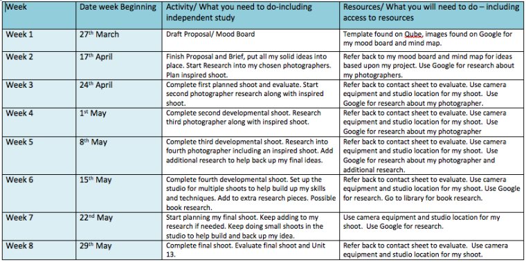
To keep my ideas and tasks on track I made a timetable at the beginning of the Unit to make sure I was up to date with any work I had given myself.

Screen Shot 2017-06-13 at 11.53.28Screen Shot 2017-06-13 at 11.53.33

I also did a weekly reflective journal to show the progress I was making within each week. I explained what I was doing each day and how that is helping me develop and move on to the next step within my project. I four it helpful using a reflective journal as it allowed me to se where I was at and what I still need to complete. It enabled me to overview my work.

I wanted my peers to check my work at a certain point to help me think about what I had already completed and to see what else I cold do to improve. I had asked the four following questions;

  • What are your initial thoughts about my FMP?
  • Is body image an issue to you when looking at magazines? Yes/No (If Yes, why/how?)
  • Could I improve my idea and final outcome, if so how?
  • Is the concept of using myself in my images like Cindy Sherman a good idea? Yes/No

By asking these question I was able to get a little bit of guidance to see if my idea was good from another persons perspective. I found this very helpful as I was able to take their advice and expand my work further.

If I were to change the project and take a completely different route I would do something about social media and what we post for the world to see. We control what we post and portray ourselves to everyone the way we want to. I feel I could have done something quite imaginative with this idea.

If I were to change anything within my existing idea and final piece, I would maybe expand some of my written research pieces to expand my ideas a little more and show a lot more imagery than I already have to show a solid idea of what I am talking about. In one of my final pieces, I felt I could have covered more white spaces with body text in my magazine spread to machete look less blank. I could have played around with different magazine logos instead of keeping to Vogue on all three pieces.

As we had a set deadline I had to make sure all of my work and especially my final images were completed in time as I had to print out my final pieces myself, ready in time for the photography exhibition that is taking place on the 19th June. In order to print them out I had to make sure the canvas size of my images were right and had to take into consideration the time it would take to print and the cost of the product. In total it cost £37 to print two images, both in 18 X 12 (inches). I wanted my images to be quite big so it didn’t drown in a big white board at the presentation exhibition. I have written a little blurb caption to go alongside my images telling the audience who I am and what my project is about. I have also asked the people assigned to the construction job to add a shelf to my board so that I can place two Vogue magazines on it. I have bought two Vogue magazines from WHSmiths, costing £2 each. I then picked another front cover and spread to showcase at the exhibition. I went on photoshop and change the measurements so that they aligned with the real magazine. I printed out my chose front cover and spread and spray mounted them to stick into/onto the magazine. I will place the magazine next to an original Vogue magazine to who the audience the difference and development between my work, it will also show what inspiration I took from the magazine itself due to the layout of text and pictures. I felt it would be a good idea to put my images into play and show the public what they would look like in their situation where they are meant to be found. It also allows me to show a few more of my final images at the exhibition instead of just the one. I have stuck an ‘Open me’ tab inside my magazine to locate people to the right page where my spread can be found. We have all been assigned to a job within the exhibition; I am to fulfil my job by painting the board ready for them to be put up by someone else. I am also choosing where everyone in placed in the exhibition, this took a lot of thought as I had to think about what people were presenting and if they need anything extra besides their board, in some cases a table was needed to showcase their work.

Overall, I based my Final Major Project on something I am passionate about; this enabled me to produce a strong set of final images that I can present at the photography exhibition.

I have published some of my photographs from this project on my website, here I am able to showcase my work publicly.

Website Link: http://racheljacob99.wixsite.com/rachelajacob


Final Shoot Evaluation

For my final shoot I was to use my photographer and research inspiration to come up with a contact sheet full of images that I could potentially use for my final piece. These images are most important as they are the outcomes of what I have been practising for the past few weeks within several different experimental shoots. The experiments shoots have helped build and develop my skills that I have used within this shoot.

There was two halves to this shoot as I wasn’t so confident with the first set of photographs that I had taken. Despite taking just over 800 photographs and picked out a solid set of 102 images I felt there was a need for a second shoot to secure my ideas and build upon them. This goes to show that it is all about quality over quantity. The first half of the shoot was mainly aimed around getting the right image for the front cover, There are hundreds of photos of straight posey faced images, something that you would see a model do on the front of a magazine cover. I tried to mimic the poses and faces that they make in order to create a close matching inspired magazine cover. There was 8 or 9 different outfit changes to give me a large variety of pictures when it comes to choosing for the main cover. The second half of the shoot was about making sure I had captured images for the inside spread, these images were editorial based and captured myself in the process of getting ready including hair and makeup shots. These shots will contrast the front cover as it is all about the pre production. I had taken a few photos like this within the first half of the shoot, however I felt that I could do better and improve the quality of the images.

The concept of the shoot was to use Cindy Sherman’s Untitled Film Stills idea and feature herself in her own images, she was to put herself in the situation of an actress as well as develop and plan the shoot also. To do this she captured the photos using the self timer setting on her camera, I did the same for this shoot as I had mastered the concept through practicing in previous experimental shoots. I had used Annie Leibovitz concept of capturing portraiture for the front cover, Rankin’s technique using makeup- I made sure I included different angles of the makeup palettes within shots to bring a bit of colour to the images as well as seeing the makeup on my face. I used Mario Testino and Lord Snowdons’s techniques of capturing both society and reportage photography, Society styled photography by Snowdon is to be featured on the front cover of the magazine. Reportage styled photography by Mario Testino is to be used inside the magazine spread. Julia Kennedy focusing on fashion, something that I haven’t taken into consideration in my shoots. Both Kennedy and Testino capture editorial styled photographs, something in which I will be including in my magazine spread. I am yet to used Carri Angel’s concept of fantasy as I haven’t photoshopped any images yet making them into something unrealistic.

For both shoots I set up the camera to Shutter speed 1/125, Aperture f/13, ISO 100 and fill flash 1/128, 50mm. I had a white backdrop with two soft box lighting either side of the set. I then stood in front of the backdrop in place ready for the camera to take the picture on self timer mode. As I was using the self timer I had the camera set up on a trip pod so that each photo was steady and in place. I felt this shoot overall was successful and I am ready to pick images to edit and include in my final piece. The previous research on magazine spread will give me inspiration on how to layout my images and text in the most effective way.


I was able to use my two assistants to help capture the photos I wanted, they were there to look like they were doing my hair and makeup, both roles were staged and posed only for the photographs. I had to bring in a variety of makeup palettes and brushes so there was different colours included in my photos. I also bought in hair curlers and hair spray so that I could take photos of the process of my hair being done. As these were editorial and not posed shots, I carried on talking and smiling whilst the camera was taking the photos as I wanted them to be as laid back and natural as possible like a candid. I wanted to keep the heavy posed photographs for the front cover. I have taken close up shots to focus on the small details like the strands of my hair, eyelashes when applying mascara etc.

Here are the outcomes of my final shoot:

Screen Shot 2017-06-08 at 15.41.01Screen Shot 2017-06-08 at 15.41.36Screen Shot 2017-06-08 at 15.41.27Screen Shot 2017-06-08 at 15.41.54Screen Shot 2017-06-08 at 15.42.03Screen Shot 2017-06-08 at 15.42.13Screen Shot 2017-06-08 at 15.43.06Screen Shot 2017-06-08 at 15.43.12Screen Shot 2017-06-08 at 15.43.20Screen Shot 2017-06-08 at 15.43.29Screen Shot 2017-06-08 at 15.43.53Screen Shot 2017-06-08 at 15.44.00Screen Shot 2017-06-08 at 15.44.18

ContactSheet-001ContactSheet-002ContactSheet-003ContactSheet-004ContactSheet-005ContactSheet-006ContactSheet-007ContactSheet-008ContactSheet-009ContactSheet-010


Final Shoot Plan

After completing multiple experimental shoots and a various amounts of research I am ready for my final shoot to take place. I have taken in all aspects of my project by covering different lighting techniques, ways to take my photographs free handed and practising my photoshop skills, all of which will be included within this shoot and post production.

To start off my shoot I will be locating it in the studio as I want to use the soft box lighting. I have found out from doing an experimental shoot that soft box lighting is best to work with as I want the subjects skin to be lightly airbrushed, smooth and flawless. This worked better than the harsh lighting as that made the subjects skin patchy and the texture rough looking. I will set up two soft boxes either side of the white backdrop. I am using a white backdrop as it is plain and will help draw attention to the subject instead of anything else that surrounds it. I want all attention to be based around my model, in this case myself. I don’t want the subject to be washed out so I need to make sure that the lighting is set up correctly and allows for the subject to be fully lit due to the flash. I want there to be no shadows created at this stage as I need to photoshop them out later and that creates unnecessary work. It is easy to set up the lighting correctly in order to prevent this. I want no shadows on either side of my subjects face. In order to trigger the soft box lighting I will use a fill flash that is attached to my camera. This flash will allow for the soft box flashes to go off and create a well lit photograph.

As I am inspired by Cindy Sherman I will be featured in the pictures as well as directing the photo shoot. I have had experience using the self timer mode on my camera as I carried out an experimental shoot so that I could practice. That shoot in particular allowed for my to find out what self timer setting was most appropriate for my shoot. I needed enough time to press the button and get into shot before the camera took the photo. I will be using Self Timer:10 Sec setting to take each photo as I found that easier to use. I will need a tripod to complete this shoot as I am using the self timer setting, I will click the button between each shot and then get in position.

There are two sides to this shoot, I will need photographs for my front cover and photographs for my inside spread. The two sets of photographs will contrast each other. The inside spread images will be editorial styled, they will be images of me in the process of getting ready for a photo shoot. I want to take photos of myself having my hair and makeup done and choosing clothes to wear. I want to take close ups of having my makeup done and focus on the small details of lashes etc using depth of field. As I am focusing on the subject I will include the hands of the people applying makeup and doing my hair but no more than that as I want the attention to still be on myself. I would like shots of having my hair curled, all key points of getting ready. The other part of the shoot is for the actual front cover, the after the ‘getting ready’ process that is shown inside the magazine. You will be able to tell all photos are from the same shoot as I will be wearing the same clothes inside and on the front cover. I liked this effect as I had seen it in previous magazines that I had looked at to get inspiration.

To complete this shoot I will need props, from makeup products and brushes to curling wands and hair spray. I will also need a change of clothes, I am aiming for around eight different outfit changes. This will give me a variety of different photos to choose from. I am hoping to set up a dressing table styled set using a table and large mirror. This will give the effect of a dressing room that I am getting ready in before the shoot. I am going to include the soft box lighting in the background of my photos to show that this is the pre production of the shoot. These photos will not be edited as much as the one on the front cover as they are meant to be the before any drastic changes are made shots. I may take some shots of the whole set to show a behind the scenes environment. I will need the help of at least two assistants, they will be included in my photos to show the process of doing my hair and makeup, only their hands and front of their bodies will be featured in my photos, no faces as the main focus is myself.

I will be referring back to all of the photographers that I have researched as they all have helped me create an image in my head, an aspect from each photographer will be used in order for me to create a set of images for my final piece.

Presentation Case Study

I visited David Hockey’s exhibition at Tate Museum in London, as well as being able to admire his work I focused on the layout and format he had decided to present his work in. One part of the exhibition that stood out to me the most was where had his iPad illustrated finished work on the wall but had the iPad itself showing the progression towards this. He presented a video on an iPad of his drawing the final piece, this showed pre and post production. As I have doing s contrast between the front cover of a magazine and the inside spread I am also using pre and post production within my work. I am inspired by the way he’s been able to show this in a different format.

He has also hung a lot of his work up on the wall, something which I thought was very effective and stood out to the eye of the public. People were able to stand in front of the paintings whilst having space around them, it was more of a relaxed environment instead of graphics everywhere. Another part of the exhibition that stood out to me what the four seasons, in the room there was large screen on each wall, it showed video graphics of the four seasons. this allowed the public to be in amongst his project and be able to view it from any angle of the room.

170206_hockney_exhibit_f4bad141e45825b1e68d956223ab638e.nbcnews-ux-2880-100073790255-80ae-4c55-baf8-b2e5bf467598David-Hockney-at-Tate-Britain-The-Upcoming-Kimberley-Archer-28-676x451


Magazine Spread

In order to get an idea on how I want to lay out my magazine spread I have decided to research into different spreads online and in real magazines, this will help influence my ideas and give me inspiration for my own work.

When looking at spreads on google images and in magazines I find that there is an equal variety of both pictures and text. I want to keep this in mind when creating my own spread so that it isn’t text or picture heavy.

Most spreads either have a main image and then have little images around it or have an image taking up one page with small pictures on the opposite page. The text is usually quite small and in columns to keep it neat, whether that is in block paragraphs or shaping around the surrounding images. As stated before I would like to have an equal amount of pictures and text as I feel it would be more appealing to the public eye. If there was too much writing the audience wouldn’t want to read the magazine or would be as interested. I want to include a main quote in the middle of the text, this will highlight points of the main body text. The beginning of the text always starts off with a single bigger letter, I think this is very effective and makes the text as a whole look good and shows structure.

Most of the magazine spreads have white backgrounds, I am going to do the same as I think it makes the spread look much crisp, neat and cleaner. It also makes the audience focus on the images and text instead of getting distracted by other colours and patterns, it also makes it easier to read the text as there is nothing else behind it.


Experimental Shoot 9 (Step by Step: Retouching an Image)

My final project involves a lot of photoshop based work due to having to edit my photos vigorously, removing any flaws and blemishes to any extent, correcting the photo by adjusting colour balance, discolouration, brightness, hue, levels, curves, liquify etc. I am to my myself look like the models you see on the front of magazines. This experimental task will allow me to practice my photoshop skills before completing my final shoot and edits. It will give me the time to perfect any doubts I have about using the software and learn and develop any techniques I have not yet used before.  I am going to use a couple image I had taken within my experimental self timer shoot to edit, this also gives me a chance to see what I will be working with as I will be editing myself again in my final images.

Step by Step: Retouching an Image

IMAGE 1:

Step 1:

I started off by making the background white instead of grey by using Levels under Image>Adjustments, I set it to Channel:RGB 0, 1.00, 255. I clicked around the white background using the white dropper tool to find the purest white without washing out my photo.

Step 2:

I used curves to adjust the colour of the the photo, I set it to Channel: RGB, Output: 143, Input: 138. This has helped with discolouration of my skin and with the colour of my clothes and hair.

Step 3;

I have no zoomed in to look at the photograph is closer detail, I see I have a few blemishes on my chest and want to get rid of them. To do so I have selected the spot healing brush tool to pick out each blemish and remove them. I have included a before and after shot of my chest area. Just by removing a few blemishes my skin already is starting to look flawless without any airbrushing or other editing.

Screen Shot 2017-06-03 at 17.33.19

Step 4:

To continue editing my chest area due to previous blemishes I have now used the Healing brush too to cancel out any possible marks I have made using the Spot healing brush tool, it will also help with discolouration. To use this tool use press the ALT key to select an area where you want to use the existing colour and then go over a similar coloured area to hide any extra blemishes. Before and after shots included.

Screen Shot 2017-06-03 at 17.41.04

Step 5:

I repeated the previous two steps of using the spot healing brush tool and healing brush tool but this time used a combination of the two tools on the face. You can see the complexion of my face is much smoother and clearer.

Step 6:

The liquify tool is a pretty big deal when it comes to post production editing in magazine industries. It is a way to create a false image, making models appearances look “flawless” when really they are just making it unrealistic. It creates an illusion that us as an audience are made to see and believe. This tool was quite fun to play around with especially as I was editing myself. I was able to make an “ideal” model version of myself. I cancelled out any extra fat around my face and made myself look slimmer. It gave me the option to change the size of the features on my face, which of course I had to have a go at. I still had to make myself look some what realistic and still look like a real person.

Step 7:

As I had made my face smaller and somewhat slimmer, the ear that is on show looked too big for my face! I had to change it and make it smaller using the forward warp tool within liquify. This tool allows you to move the picture around until you’re satisfied with the way it looks.

Step 8:

I used the forward warp tool within liquify to make my body look a little smaller, i took in my body from both sides to make it appear slimmer. I then used the pucker tool to make my head the equivalent size to my body along with my hands smaller too. Everything has to be proportionate to each other.

Step 9:

Due to the previous stay of using the liquify tool, The white background has moved along with it, to fix this I used the eyedropper tool to pick up the white background colour and then the paint brush to fill in the miss gaps.

Step 10:

To finish off the image I cropped the bottom off using the cropping tool located on the side bar.

Screen Shot 2017-06-03 at 20.10.01

Before and After:

When I look at the difference between the before and after images, I feel like more work needs to be done to my face, the head in proportion to my body doesn’t look right, I can’t quite put my finger on what is wrong, it just doesn’t look completely right.

IMAGE 2:

Step 1:

For the second image I thought it would be quite fun to edit as I haven’t got a jacket on and I can play around with my body shape in liquify. For the first step I have adjusted the colour balance using levels. I set up the levels settings to Channel: RGB, Input Levels: 0, 1.00, 255. I clicked around the white background using the white dropper tool to find the purest white without washing out my photo.

Step 2:

I used curved under adjustments to adjust the colour in the image of my hair and skin. Channel: RGB, Output: 123, Input:114.

Step 3:

Where the skin was showing I used the spot healing brush tool to get rid of any blemishes and flaws. To do so I have selected the spot healing brush tool to pick out each blemish and remove them.

Screen Shot 2017-06-03 at 20.33.10

Step 4:

I then used the Healing tool to get rid of any discolouration or remaining blemishes left behind after using the spot healing brush tool. To use this tool use press the ALT key to select an area where you want to use the existing colour and then go over a similar coloured area to hide any extra blemishes. Screen Shot 2017-06-03 at 20.33.18

Step 5:

Now instead of moving my facial features around like I did in the previously retouching process, I am going to have a go at playing around with my body figure and how to try and make it look like the “ideal” “perfect” shape. I will enhance my curves and cinch in my wait to make it appear smaller and slimmer. To do this I will use the forward warp tool within the liquify tool.

Step 6:

The edges of my body are a little rough due to the folds in my clothes, to me this perfect I am going to smooth them out using the paint brush tool. I selected the area surrounding my body using the eyedropper tool to pick up the correct white, I then smoothed out the edged with the paint brush tool by going over the rough edges. This gave my body a smooth hour glass shape.

Step 7:

I felt like my hips looked a little too unrealistic and too big so I went back in with the forward warp tool and made them a bit smaller so they curved well with my stomach.

Step 8:

To make my arm proportionate to the rest of my body I used the forward warp tool once again to make my arms appear slimmer.

Step 9:

Due to the previous stay of using the liquify tool, The white background has moved along with it, to fix this I used the eyedropper tool to pick up the white background colour and then the paint brush to fill in the miss gaps.

Step 10:

To finish off the image I cropped the bottom off using the cropping tool located on the side bar.

Screen Shot 2017-06-03 at 21.32.27


Before and After:

I feel that this retouching experiment went a whole lot better, I was able to practice my skills from the previous retouch image experiment. I have successfully made my body into the “ideal” figure and will use this technique when I edit my images for my final shoot.


Photoshop Influence

On a day to day basis, images tend to go through an editing process before hitting the pages of magazines and advertisements publicly. This stage can have a big impact on readers and cause them to have a false perception of the “perfect” body. Usually the images are of female celebrities allowing us to think that they are the real expectations of a good body, when in reality photoshop has played a big part. Not only will they make celebrities look slimmer but gossip magazines will also make them look worse to help back up their shaming column about them.

Thomas and John Knoll founded Photoshop founded in 1988 as they decided they wanted to edit image afterwards. Ever since this moment, the media and graphic industries and taken over and have produced millions of images using this software. There have been multiple debates on whether or not photoshop should be banned as it has an effect on today’s society and their beauty standards.

Photoshop was there to show greyscale images on a monochrome display and then later on upgraded to an editing programme. Photoshops original purpose was to edit images by cropping or adding colour effects. However, this has changed dramatically as photoshop’s use is to now alter someones body figure and facial features completely.

It is to people’s knowledge that Photoshop is commonly used within magazines, advertisements, television etc. Once a “perfect” “Flawless” looking body has been presented publicly it is assumed that photoshop was used. Despite this, some people can’t quite come to grips with the behind the scenes type of editing that takes place before post production. The amount of different jobs that go into editing a single images takes effort and time, especially when having to make something so fake look realistic at the same time.

“A UK survey showed that 15 percent of the 18 to 24 year olds surveyed in a 2000 people poll, believed that the models who are used in mass communication, accurately depict what the human body looks like. According to the same survey, over 650 of the survey’s participants were “unconfident or extremely unconfident with their body.”” 

This survey that was taken shows how much impact a single model that is being publicised can have on an audience. 15 percent of the 2000 people that they surveyed believe that models that take part in the publicity accurately depict the human body meaning that what you see on the front of a magazine or in an advertisement poster etc is edited correctly and portray the body in a positive, accurate light. However, over 650 people who took the survey felt unconfident with their body when comparing themselves to what they saw. As a teenage girl I feel insecure about myself when looking at magazines filled with society’s perception of the perfect body that they have taken time to retouch and adjust on an editing software. They problem of people not being able to be happy with themselves has lead both men and women to health officials as they are dissatisfied with their own bodies. Licensed Phycologist Dr. Sarah ravin believes that photoshop has been over used to the extent that people are left feeling bad about themselves. Certain features of the human body have been focused on and overly edited to ensure it is ‘perfect’ looking.

When I carried out a questionnaire to determine what was good or bad about my overall project and idea, I had asked “Is body image an issue to you when looking at magazines? Yes/No (If Yes, why/how?)” I received back multiple pieces of feedback telling me that they are affected by what they see on the front covers of magazines as they don’t have a figure like that. A few responses that stood out to me were one that mentioned about setting a beauty standard for young women and that they’re isn’t a large variety when it comes to models as they are near enough the same size, caked in makeup and hair done.

Despite Photoshop making many people feel insecure, different companies have also messed up in the process of publishing images that have been overly edited. They have posted flukes within existing photoshoots such as having elongated arms, overly airbrushed limbs, or non proportional body parts. This is all down to illusion and what people think society want to see. I feel that a photoshopped image is not realistic in the slightest, as magazine companies and industries want to portray the models in a good light as what they publish is what the audience will see and will change the way we see them via the media. The photographs create false portrayals and may effect the visual world that surrounds us.

“Seventeen magazine believe that discontinuing the use of the program will actually allow them to better connect with their audience. Emily J Legleitner, The Michigan Time Assistant Layout Editor, believes that companies who are starting to eliminate the use of Photoshop are leading an important movement.”

Movements such as the one stated above proves that there are certain magazine companies that do not believe in the necessary photoshopping process, especially coming from Seventeen magazine who targets a younger ranged audience. If girls are seeing photoshopped bodies that they think are the realistic portrayal of the human body then they could face issues of insecurity from a young age.

““Companies should absolutely stand up against Photoshop, especially those that once endorsed it and now see the damage it has caused,” Legleitner said.”

All companies can see the damage that they have previously made by publishing different campaigns and advertisements. Despite this, what ever gets the public talking is a plus for them and their profits. No matter how big the mistake or damage that was made, the companies will still continue to use photoshop, I feel they rely on it way too much for unnecessary  reasons.

Dove released a “Real Beauty” campaign that expressed about the photoshop being a problem and how women should be made to feel uncomfortable and insecure due to what they see in published ads etc. Dove show the audience something realistic than an edited model, something other companies wouldn’t do due to keeping a perfect looking reputation.

“Dove’s “Real Beauty” campaign also aims to celebrate women and their natural bodies by raising awareness and fundraising for women empowerment. In the early 2000s, Dove’s managing team was looking for ways to revive their brand after being overshadowed by other companies.”

I think this campaign was a good idea and shows people the secrets behind an edited image and the work that goes into each detail within it.

The video below is a good example of a companies use of photoshop, something that Dove is proving to be a problem in today’s society.

https://www.youtube.com/watch?v=iYhCn0jf46U&feature=youtu.be

As a whole, photoshop creates a false and unrealistic exception of what people see as being pretty and flawless. People think that there is only one specific way to look and base it off of that when in reality, everyone comes in different shapes and sizes and no two people will ever look the same.


Experimental Shoot 8 Evaluation + Contact Sheets (Burst Mode/Continuous Shooting Technique)

I am glad that I did this shoot as I was able to find out for myself that this technique does not work for what I want it for. I set up my camera to Shutter speed 1/125, Aperture f/13, ISO 100 and fill flash 1/128, 50mm. This combination usually allows for a well lit white background and foreground so that the subject, in this case being myself caught the eye of the audience. However, to set up the self timer continuous setting you have to click on the right mode and insert the number of shots you wanted it to take.

img_7008

It was going well when I clicked the button to take the photo and it started counting down as usual, until I discovered that the shots were too close to each other and it didn’t give the flash enough time to go off for each photograph, this meant that only 2 or so of the shots were lit and the other remaining shots were pitch black. The photos that had flash were not fully lit either, the soft boxes was not given enough time to do a full flash meaning only one side of the flash went off creating a dim grey background. The time given between clicking the button and taking the photos was not a lot, it didn’t give me a lot of time to get ready in position to have the photo taken. Most of the photos in my contact sheet show me getting ready mid shot, there are only a few photos where I am actually ready despite the flash not syncing properly.

burst1burst2

Overall, the self timer continuous technique did not work as it didn’t give me enough time in between and wasted shots as half of them turned out black. The majority of the pictures taken from this shoot would not be appropriate to feature in a magazine let alone on the front cover, in order to have a slight chance of making it into a magazine spread they would need to go through a heavy process of photoshop to make them remotely good due to lighting problems and colour balance.

When looking at the camera settings I tried to look for a quick alternative, I noticed the continuous mode but soon realised that it required a finger on the button at all times in order to take the on going shots. As I am directing and featuring in this shoot on my own, this technique will not work.

img_7013

Experimental Shoot Plan 8 (Burst Mode/Continuous Shooting Technique)

As I am using Cindy Sherman’s concept of using herself in her images I need to find a way to produce images myself whilst also being in them. I have previously tested out the self timer technique and that was very successful. I want to widen my research and technique skills by finding out if there is any other options when taking photographs on a timed triggered scale.

I will be basing this shoot in the studio, using a white background and two soft box lighting either side of the set up. I will use a fill flash to trigger off the soft box lighting flash. I am going to capture usual portraiture photographs just to get the hang of using the self timer continuous shooting mode on my camera. I will have to check back and forth between shots that I am in the right position like I had to for my previous self timer shoot. These types of shoots take time to get the right outcome but can help you develop your skills and practice exploring different camera settings that I wouldn’t normally use.

By the end of this shoot I want to find out whether using self timer continuous shooting is successful or not for when I take my final images. I need to find the easiest camera setting technique so that the final shoot runs smoothly. I want to finish the shoot with an outcome of 40+ portrait images of myself, these images need to be appropriate to feature in a magazine.