Category: behind the image
Stop Motion Evaluation
Contact Sheets:
CS1 CS2 CS3 CS4 CS5 CS6 CS7 CS8 CS9
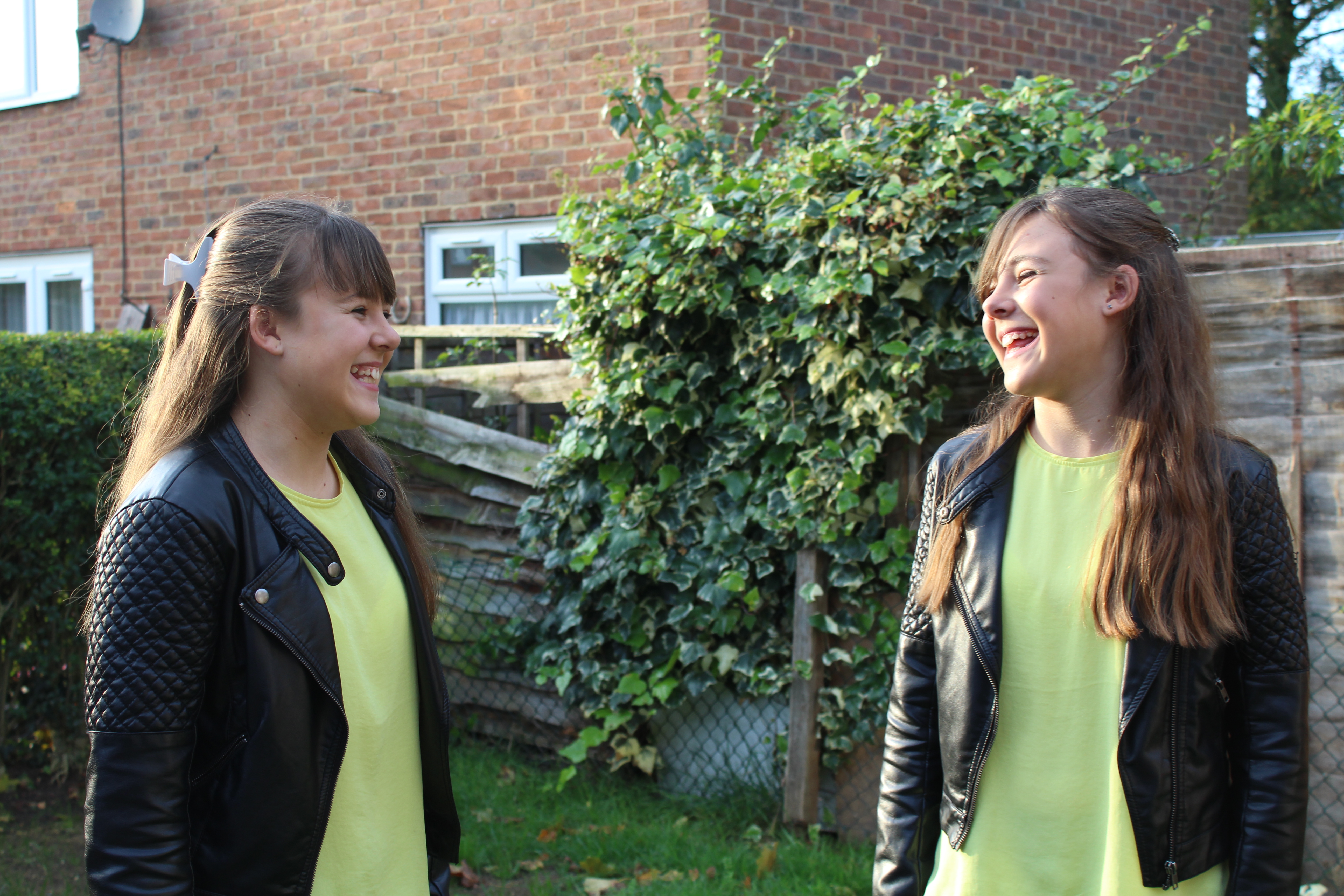
I have made my 90 second Stop motion based on advertising the makeup brand Mac. As I have explained in my plan, I decided to use the idea that Chanel used when advertising their products by keeping my stop motion under one branded name, that being Mac. I feel this made my video look more presentable and neat than having a variety of different branded makeup in my video full of packaging of different shapes and sizes that could possible make it look messy. My idea was to present the Mac makeup under the name of beauty, I made the title “The Beauty of Makeup” to show how a few makeup products could make a girl feel good about themselves, this doesn’t mean to say that you need makeup to feel or look beautiful.
To make this video I used a tripod to make sure the photos were taken all in the same position so that when they were put together to make the video there was no sudden movements due to jolting cameras. I shot my photos on my dressing table in my bedroom, I felt this worked best as my dressing table is white making the products put on top of it stand out and the table top is glass so that when I wrote on it with Lipstick it was easy to wipe away again without damaging the surface. I started off with natural lighting, I know I mentioned previously how I wasn’t going to due to another stop motion I worked on that went terribly wrong, However I managed to shoot in the day the title part of the video and when I finished it later on I was able to adjust the camera settings to brighten the photos so that my images were consistent all the way through my video.
I had finished my shoot with 850+ photos ready to be put into premier pro to make my video, the editing process was actually easy this time round compared to previous times I have tried to edit my stop motion videos, I think this is because I knew what to do this time due to practice and learning on the way. If I was told to edit this 90 seconds long video the first time round without using this software before in my life I would have struggled badly. I dragged in my 850+ photos and put them all to 0.3 seconds each, this being to long and making my video 1 minute, 43 seconds when I needed my video to be 1 minute 30 seconds exactly. To make it 1 minute 30 seconds I adjusted the writing lipstick on the table images to 0.2 seconds which shortened the video the way I wanted it. I managed to get the exact 90 seconds in the end.
I wanted to make my video enjoyable to watch and to do so I added some up beat music in the background, my choice of song was ‘What you Know’ by Two Door Cinema Club, I chose the instrumental version so that there was no singing as I feel like that could distract the audience from what is going on in the video itself. As the video had to be 90 seconds the music suddenly stops at an awkward loud part of the song, this was just the way it worked out as I placed the first 90 seconds of the song into the video. To avoid the awkward stop I faded out the music towards the end by dragging in an audio transition called ‘Constant Power’ over the top of the last few seconds of the audio. I could chose how long the fade of could last for before the ending of the video.
Apart from possibly seeing a small logo on the packaging, I never stated what brand it was until the very end, I feel like if this was to air somewhere like on TV it would make the audience intrigued to see what makeup brand this was and where all of these wonderful products are from. Therefore, leaving the makeup brand name until the end was the right decision has it will leave the audience watching until the end to find out the brand.
The text was easy to add; simply add a text box and write what you want it to say. In my case it was “Mac Cosmetics”, to get the “Mac” bigger than the “Cosmetics” I had to make two separate text boxes, I made the “Cosmetics” text font smaller in order for it to fit underneath the “Mac” text. I think the composition of the text is more interesting to look at than just writing “Mac Cosmetics” across the screen. As the Music fades out I got the text to fade out also, I think this really makes a change to the video and makes it look like a lot of effort has been put into it. To do this I lowered the opacity number to zero so it faded from 100 to 0 meaning it completely disappears by the end of the video.
This video definitely took time to make due to the small movements of the products between each shot, however was so worth it as I am so pleased with my final video outcome. If I was to do this again I would try shooting in the studio, I couldn’t this time round as it was difficult for my to bring that amount of makeup into college especially with the amount of money each product costs, I could afford for anything to damage. Once again I would like to try soft box lighting, however this time round I did like my lighting as it was consistent through out my video but to be able to say I used it would help the quality of my video. As I have previously mentioned, if we were asked to do this again I would definitely be more confident about it than I was when we first started learning about stop motion. My connection and understanding with Premier Pro and the way stop motion works has grown and has enabled my to learn new skills. I would say I am able to explain how the software works to someone who hasn’t used it before or help someone who is struggling to work it.
Linda Tubby Inspired Shoot – Texture
Contact Sheets:
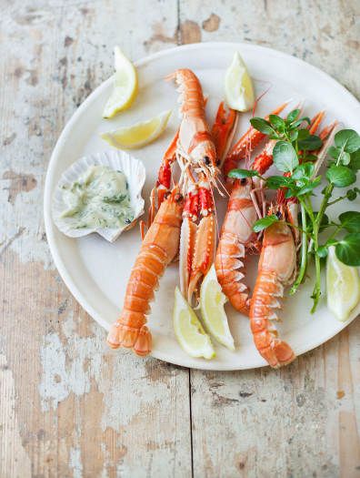
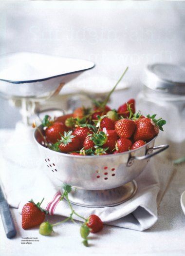
I feel just from this shoot that I am not interested in food photography however the shots I got were inspired by Linda Tubby as she presents her photos on a wooden table and positions her food and cutlery so that it is appealing to look at.
Best Outcome:

Tone Shoot
Contact Sheets:
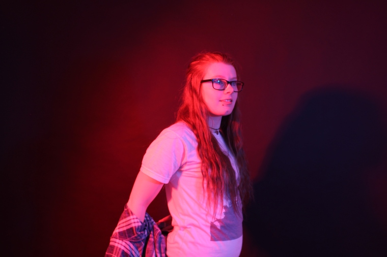
I really enjoyed this shoot as I was able to produce some brightly coloured photos during this time. The photos could be improved in one way of another due to the harshness of the lighting. In most of the photos I wasn’t able to achieve the two coloured lighting effect as the light connected to the flash would always win over so would take over the photo. There was one photo where I was able to get both colours on each side because I got one of my friends to press the flash button on the light the same time I was taking the photo.
Best Outcome:
This was the best outcome as both coloured lights from each side are visible in the photo.
Jill Greenburg Research- Tone
Jill Greenburg is a photographer based in America who is known for her portraits. She has had a passion for taking photographs since the age of nine. She has started her photography off by taking photos of her dog. She has taken classes at the Cranbrook Academy of Art and the Detroit Institute of Arts. She had also attended the Photography Summer Session that was held by Parsons School of Design in Paris in the year 1984. She had completed the coursework at Brown University in 1988 and by the end she had graduated with honours from the Rhode Island School or Design with a Bachelor of Fine Arts in photography.
One of the projects that Jill had taken pictures for was a portraiture coloured lights shoot. I really like these photos as colour is a key point for me when analysing photos. I feel the brightly coloured lights stand out to me the most out of all the photos she had taken. These would have been taken by having her subject stand in front of a plain coloured background, preferably black or white and have 1 light either side of the subject shining towards them projecting the light on them. On the light there would be coloured gel plastics to make the light a certain colour when the flash goes off. This makes the photos very colourful and creates tone due to light coloured points of the face and body and shadows due to the parts where the light doesn’t catch. Depending on how the flash comes out and how long it is on for due to shutter speed depends on how strong the colour is. Within these photos she was trying to capture fashion and beauty which I think she has done successfully. The colours overrule the photo however as you are wanting to focus on them more. When looking at the tone element of each photo you notice how well the photos have come out and how well she has positioned the subject in order to achieve these shots. Here are some examples of her work below:


Another example photographer that takes photos using the coloured lights is Zoey Grossman, She has used Celebrity recognition for her photos, this attracts a large ranged audience due to the fans of these celebrities. Justin Bieber and Selena Gomez being apart of the photoshoots in particular. The lights aren’t as strong as Jill has used in her photos. Zoey’s coloured her photos lightly compared to Jill’ photos which are coloured harshly. The coloured lights photo shoots have really inspired me for this weeks shoot. Here are the pictures that Zoey has taken using celebrity impact:


For my shoot I am going to attempt to take portraiture styles photos and have the coloured lights shining in from both sides of the photo. These lights will project onto my subject making them turn the same colour as the light. To make this happen I will have a light on either side, I will have to use harsh lights on both sides as the plastic gels will not be able to fit over the large soft boxes. So in order to fix this I will have to stick the gels of a small harsh light whilst I take the photo. I will experiment with different colours until I get the desired photo.
Micro Project
My micro project is going to be set on promoting a specific make up product. To do this I will capture this product in different forms, on the face and in the packaging it is produced in. When the product is on the face I will capture it in different angles. When taking these photos within the studio and at home I will be able to draw attention to different techniques such as depth, colour, texture, portraiture and still life. By adding this to each image it gave it a touch of creativity as it is hard to achieve this on the face without a bit of photoshop.
Rankin
John Rankin Waddell is a British photographer who focuses his work on portrait and fashion.
He has been taking photos for different campaigns including Nike’s Lace up Save Lives and Women’s Aid. He has taken photos of celebrities for his portraiture work such as Cheryl, Sam Smith, Miley Cyrus, Demi Lovato, Rita Ora, Cara Delevingne, Adele and many more. This has given his work a wider ranged audience as people who support these artists would be interested in his work also. He has a number of bibliographies written about his life and work. As well as this he has shot for a variety of different music videos and CD album covers.
Rankin uses a range of bold coloured make up whilst in front of a white or black background, this is so that the make up within his photos stand out the most. He makes the viewer realise what a difference make up can make and how different colours can really compliment each type of skin tone. The experimentation of different colours used expresses a ray of emotions and can reflect mood.
By using Rankin’s ideas I am going to use the bold colours on plain clear skin. The make up will then stand out the most within each photo I will take.


Taylor James Production
Taylor James is a production company that collaborates with a variety of different brands and agencies to promote their products by creatively advertising. This advertisement is distributed in many ways such as digital, print and broadcasting. Taylor James Production is based in New York and London, both studios aim to deliver the clients what they want by creating animations suitable for their promotion.
Taylor James Production has been around in London since 1999 and was founded by Glen Taylor. He did this to achieve his creative aspirations. This started out as just a photography based company but stretch out to cover the full media by advertising and promoting different brands. His Production has grown so much over the years and has no progressed to offices in London and over fifty full-time artists working in New York. His production covers across multiple media in partnership with some of the top agencies and brands that are well known around the world. Each project that the production are assigned to is made sure to be creative and unique so that the viewers are attracted to it as it would stand out to them.
TJP incorporates graphic designs and fine arts into film and TV production, their idea of advertisement is unique to any other. As the production has a team of over fifty people, the company can assign as many people as they want to each job role through out the whole industry. The jobs include directors, producers, editors, photographers, designers, illustrators, retouchers and animators. With the work of all of these talented people the outcome of the finished piece can turn out to be something extraordinary.
One of the projects that the TJP had focused on was a partnership with Claire Harrison, a make up photographer. She had taken the basic photos of the subjects face with bright make up on. Taylor James added the explosions to the face to make it look like the make up can exploded around it. The explosions are the same colour as the make up to make it blend in. The mini explosions is like a colour mood board to see what colours were involved within the make up.


Claire Harrison
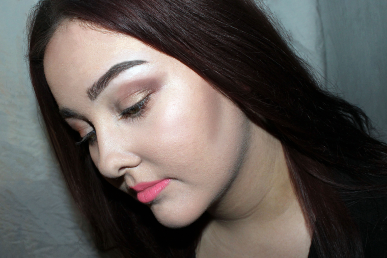
Claire Harrison is a London based photographer who focuses on portraiture when capturing the subjects face covered in a full face of make up. The base of the models face has been well covered in the right skin coloured foundation, then added a bright colour lipstick or eyeshadow. The main photo may be quite plain filled with dull colours due to dark coloured hair and basic fresh skin. However, because of the eyeshadow and/or lipstick are brightly coloured they stand out the most. The dark and light colours contrast against each other. The facial expressions made by the subjects give meaning to each photo. There is one set of photos that I really like where the model has either a soft lip with bold eyes or bold lips with soft eyes, there photos really have a contrast of colours and are really pleasing to look at.
In some photos the background is of a spring themed background filled with white flower blossomed trees. The model in front is then wearing a soft, sweet coloured make up look. The lip and eyes are not heavy at all. The models are well dressed and styled when posing for the photos. A red lip may not go with purple and silver lids however, Claire has made this work as it brings something new to each picture.
As I like the idea of the soft and bold put together, I will focus on the product I am promoting to be bold so that it stands out to the viewer. The soft makeup will just be there to complete the make up look.


Technical Research
Depth of field
I will be using depth of field within a few of my photos of the make up products. Depth of field is the distance between the nearest and furthest object. If the closet object is in focus this is called shallow depth of field but if the full image is in focus and in lens view then this is called broad depth of field. Rankin uses Depth of field as the photo focuses on the subject and blurs out the background.
Texture
When taking my photos for my project, texture will be used within all of the photos as each project or base of skin will have different textures. Texture is the feel, appearance or consistency of a substance that you can see on the surface. My micro project is a good example for texture as make up has all different types of consistencies when settles on the surface. Rankin and Claire both use texture when taking their photos as you can see the constancy of the skin and make up.
Still Life
I will be capturing the main products on their own using still life. Still life is when objects such as flowers or fruit is arranged to then be taken a photo of or to be drawn or painted. Still Life is key when in the art or photography industry. Rankin Taylor James uses still life when capturing or editing their photos as the products have been placed their to take photos of.
Portraiture
To see how the make up product looks on a persons face, I will be using portraiture styles photographs to show this. Portrait photography is when a photo is being taken of a single person or group of people that displays a type of expression or mood within the personality of the subject. When taking a portrait photo it is mainly focused on the face however can be full body images including the background. Rankin and Claire Harrison have both used portraiture when capturing their models with a full face of make up. They have both mostly used head shots however, full body and head and shoulder images have been included also.
Shape
The way an object is formed, the outline of something in a photograph can be really intriguing to look at especially when looking at make up.
Lighting
I plan to use soft box lighting on the still life photographs as I don’t want the light to be harsh. The photos will be taken in the studio as I need to use this type of lighting. The portraiture photos will be taken with natural lighting coming through from the window and artificial lighting from the lamp. Rankin, Claire and Taylor James would have used soft box lighting as the lighting is soft and not harsh.
Create Something New
For the ideas that I have in my head, I would like to create an advertisement for a make up product. When taking my photos I can include various different techniques that I have learnt overall. For example I will include depth of field, still life, shape and texture with soft box lighting in one photo. This is combining a number of techniques into one. Depth of field in the picture is most likely to be shallow as I want the product and only the product in focus. Still life is involved by me placing the object there and photographing it, it is still and non moving. The texture of the make up is shown in the pictures from the product itself as well as the packaging. Shape is included as each item of make up is packaged differently and comes in all different shapes and sizes. By adding all these elements into one picture it can really make my photos stand out and attract the viewer as I am changing it up a little bit instead of focusing on one element.
Shoot Plan
For my shoot I am going to take photos of make up items to promote for the selected brand. Taking the idea of Taylor James I will create a promotional picture to distribute as a poster for the product. Using Rankin’s ideas, He also does promotional pieces however with Rankin I will be using his make up ideas. I want the make up to stand out as much as possible, so in order for this to happen I will use depth of field on some photos so that the viewer focuses on that. Bright colours will be needed in order to achieve this also. Claire Harrison’s ideas will help me to achieve a bold makeup look, the strong outlines of each make up item applied to the face will give a clean fresh look. To make this happen I will apply the make up for example the lipstick to the lips but then apply concealer to the edges of the lips to neaten up the edges and make them look more clean. I am going to use various different make up items in order to play around with it and see what works best for my photos. The more make up products I use on each shoot the better.
The two locations for my shoot will be at home and in the studio. I want to try both to see what effect works best. When working in the studio I will be able to use the soft box lighting against a black or white background where my subject will stand in front. With this setting I will be able to take photographs using shallow depth of field so that the only focus is on the subjects face. The texture of the face and make up will be visible on the photos so the viewer can see the constancy of the make up product whilst on the face. When working at home I will use a lamp to shine light on the models face as well as using natural window light for my subjects to pose next to, however straight away I feel that the studio pictures will work much better.
After my shoot has been completed I am going to attempt to edit the photos on photoshop to add the effects Taylor James gave to his photos. The effects he gave to the Make up photos that Claire Harrison produced was small explosions to the eyes and lips to look the product had spilled on her face. The small make up explosions that I will add will be the same colours as the make up I have used on the face, this will also show what colours have been used.
Contact Sheets
Evaluation
The Micro Project has been a great way for me to show off my photography skills and show what I am best at. These skills vary from the way I use my camera to the different techniques that I have picked up on whilst being here at college. To start off with I have researched three different photographers that incorporate within the theme that I have chosen for my project. When researching the photographers I find it makes it easier to grasp the concept of each skill the use and why. For example, Rankin would use bright coloured makeup to extenuate that facial feature to make it stand out to the viewer; to help this he would use shallow depth of field to focus on that feature. This shows how make up can have such a big impact up on the face and what a difference it can make. Once I had finished the researching of photographers I started researching the techniques in order for me to use them correctly and to show I understood I knew what they meant by using them in my project.
I explained step by step what I’m going to do to achieve the final outcome of photos within the shoot plan. I said how I was going to involve each technique that I had chosen and merge it into one of three photographers. This way I was able to use the help and ideas of the photographers that I have picked out to show I was inspired by their work. I had ideas in my head of how I wanted my pictures to look, for example the composition of the make up products or the way I wanted my models head to be tilted. Both types of pictures were to come together in the end to create a final piece of a make up product advertisement.
I had two shoots planned, the first one being at home and the second one being in the studio. The home shoot was in my room, I had pinned a white sheet to my wall to act as a white background so I could get some images that were easy to edit. Two of my friends were models for this shoot and allowed me to put a full face of make up on them ready to take pictures of. I took photos of their face from different angles to catch the best lighting where it highlighted parts of their face which made them glow. The flash really helped capture the colour well. I got them to make different facial expressions so that I had options when coming to pick my final pieces to edit. I experimented with the different colours of make up to get the best results.
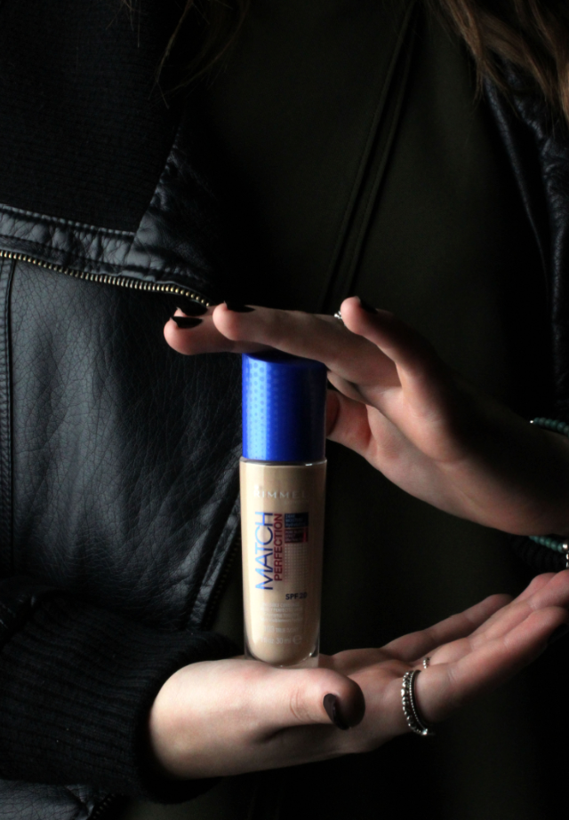
The second shoot was in the studio and this was for taking photographs of the product itself. I had used the white background and made it sit on top of the table so there was no distinct line showing where the back wall meets the floor. I placed a soft box on the left side of the table so that the light would hit softly only on the left side to create shadows. I was really pleased with the outcome of these photos in particular as the lighting really helped and made the photo crispier and more professional looking. I positioned the products in a certain way so that the brand name was always showing and the colour within the package was noticeable.
Whilst playing around with the products I decided to have one of my friends hold the product showing the viewer how big it is whilst it being in her hands. This was a great way to present the product also.
If I was to try this micro project again and had to make it better I would maybe try out some different make up looks to switch it up a bit.
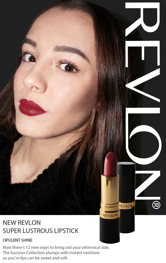
For my four final pieces I have decided to have one single model photo, a product standing on its own, the model holding the foundation and a Photoshopped edit of an advertisement poster for Lipstick including the brand name of ‘Revlon’. I had made sure that each of the photos has some type of impact from each of the photographers that I had chosen and that each technique that I had picked up on was involved somehow.
Final Pieces
Francesco Tonelli – Back in time for dinner
Back in time for dinner is about a family changing their lifestyle around food, experiencing the way they would prepare and eat food back in the days. This is to show how much our lives have changed depending on the foods that are available to us.
If this type of food like rations were only available to Francesco Tonelli at the time whilst he was shooting for his food photography projects then the food in his photos and the way he positions and prepares his food would be different. Depending on what would be available to him would change the outcome of his photos. However, Due to the food items included in his photos, it goes to show when capturing sweet foods he uses old brands of chocolate, ice cream and sweets. For example, he has taken picture of Godiva Chocolate, a chocolate that has been around since 1926. The photos focus on the contrasting of colours between the dark coloured chocolate and brightly coloured fruits and flavouring that used in the chocolate itself.
Francesco started off taking pictures of dishes in order to document them for his students. He then would take pictures of his meals at home, whilst doing this he would play around with the settings on his camera in order to get the best pictures possible. Back in the day he wouldn’t have been able to access the lighting he has used today, he has most likely used a soft box as the lighting isn’t harsh at all. The edges and curves on the items are all smooth and the food looks so appetising that it makes you feel hungry by just looking at it. The liquid foods really do show as the lights reflects off and creates a white boxed shine.
Inspired shoot using Colour- Contact Sheets
Contact Sheets:
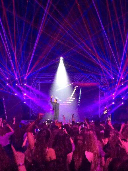
I feel this shoot went really well because not only did I enjoy myself by seeing music artists I love such as Justin Bieber and Nick Jonas; I was able to take the pictures I wanted as it wasn’t hard to capture a picture without having bright colours involved. I liked to capture shots of the full stage to show all the colour involved. For example, Nick Jonas’ set covered the full stage full of colour with purple, pink and red thin lights that intertwined with each other. I was able to attend another concert at Brixton Academy a couple weeks before that I was able to use the pictures i took for this shoot as they fit in with the colour theme, Years & Years set was full of bright contrasting colours through out the whole hour. I feel more with their set that the colour depended on the mood of the song, Eyes Shut is quite a slow song so the lights were dimmed and blue. I think that this colour scheme went really well with the song. The bright colours I captured I feel were definitely inspired by David Lachapelle, however i was able to have my own take on his use of colour just in a concert environment.
Best Outcomes:

Food Photographer Research- Texture
Linda Tubby likes to focus capturing pictures of all types of food. Linda has such a passion for food and cooking. This inspired her to take the photos for her projects based on food photography. When looking at her photos the thing that stands out the most for me is the colour. Each photo has a real pop of colour as the background is usually a clear plain colour, however is decorated with perfection. Not only does she just take photos of food but also develops her own recipes and writes features for magazines and her own books. She helps bring other peoples recipes alive for photography. She enjoys each step of creating the best picture possible, from the cooking of the food to the composition of each item in the photo. The way she positions each item in the photo helps the food look more appetising enough to eat. When used in cook book the pictures engage and encourage the reader to then cook the food. Linda has an eye for food and can work well with this technique.


In order to use Linda’s work for inspiration, I am going to collect together a lot of brightly coloured food to take photos of like a pre production process of how the food looks before used in a recipe. I can then take photos of the finished food product whilst presenting it well on a decorated plate infront of a background.
Landscape Portrait Shoot Contact Sheets- Mary Ellen Mark
Contact Sheets:
I really enjoyed this shoot as I was able to work around something I love, my family. Being at the Age of 10 I feel they really enjoyed the shoot posing for it as well as I did capturing the photos. I shot some of my photos close up as well as getting some full body shots. In both types of photos you can really feel their emotions and expressions within them. You focus on their faces as they are the main subject. I used the aperture feature on the top dial. Depth of Field allows you to focus on the main object that is usually in the centre of the photo and have the background blurred; this makes you ignore what’s going on in the background. I focused on having most of my photos taking in shallow depth of field, this means that the closer object was in focus and the background is blurred. By changing the ISO I was able to play around with the different lighting until I got the right one.
Best Outcome: